|
Excel: It All Adds Up
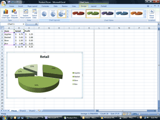
People read
charts better than they read columns of data. What percent of this pie
is apples? Try it:
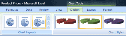
Click on the chart to select it Go to the
Chart Tools Select the
Design Ribbon Look for
Chart Layouts and click % Chart
Styles: Color and position help to tell the story. The pie chart is
teaching retail sales percentages. Please try
some of the options available in the Chart Styles.
|
||||
|
| ||||